"usingComponents": {
    "ui-card": "mp-cu/colorUI/components/ui-card/ui-card"
}
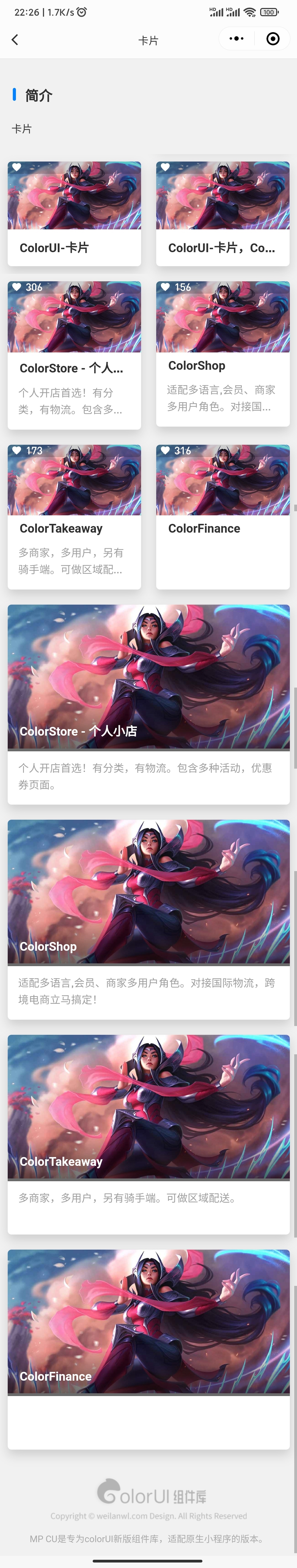
<ui-card ui="shadow m-3 radius" imgHeight="auto" img="img" title="title" isTag>
    <view slot="tag" class="ui-tag bg-mask-20 radius-lr">
        <view>
            <text class="cicon-favorite mx-2"/>
            <text>{{item.like}}</text>
        </view>
    </view>
</ui-card>
<ui-card ui="shadow m-3 radius" imgHeight="180rpx" img="img" title="title" desc="desc" isTag>
    <view slot="tag" class="ui-tag bg-mask-20 radius-lr">
        <view>
            <text class="cicon-favorite mx-2"/>
            <text>{{item.like}}</text>
        </view>
    </view>
</ui-card>
<ui-card ui="shadow m-3 radius" img="img" title="title" desc="desc" fixedTitle/>
| 参数 | 类型 | 可选值 | 默认值 | 说明 |
|---|
| ui | String | - | - | 其他class |
| img | String | - | - | 图片地址 |
| imgHeight | String | - | auto | 图片高度 |
| title | String | - | - | 标题 |
| fixedTitle | Boolean | - | false | 浮动标题 |
| desc | String | - | - | 内容 |
| imgUi | String | - | - | 图片样式 |
| isTitle | Boolean | - | true | 标题插槽 |
| isTag | Boolean | - | false | 标签插槽 |
| 参数 | 说明 |
|---|
| 默认 | 内容插槽 |
| title | 标题区域插槽 |
| tag | 标签区域插槽 |